Museum of Pop Culture
A collection of digital and print work I created for events, programs, and organizational promotion as a marketing graphic designer for the Museum of Pop Culture (MoPOP) in Seattle.
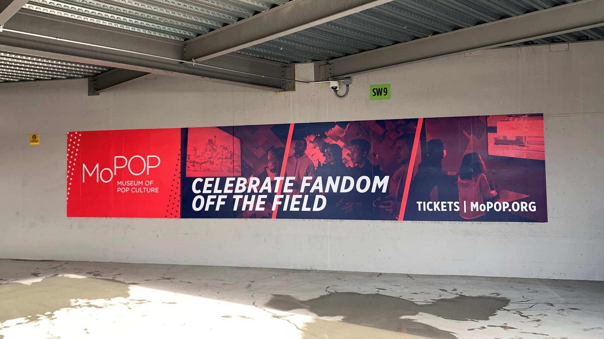
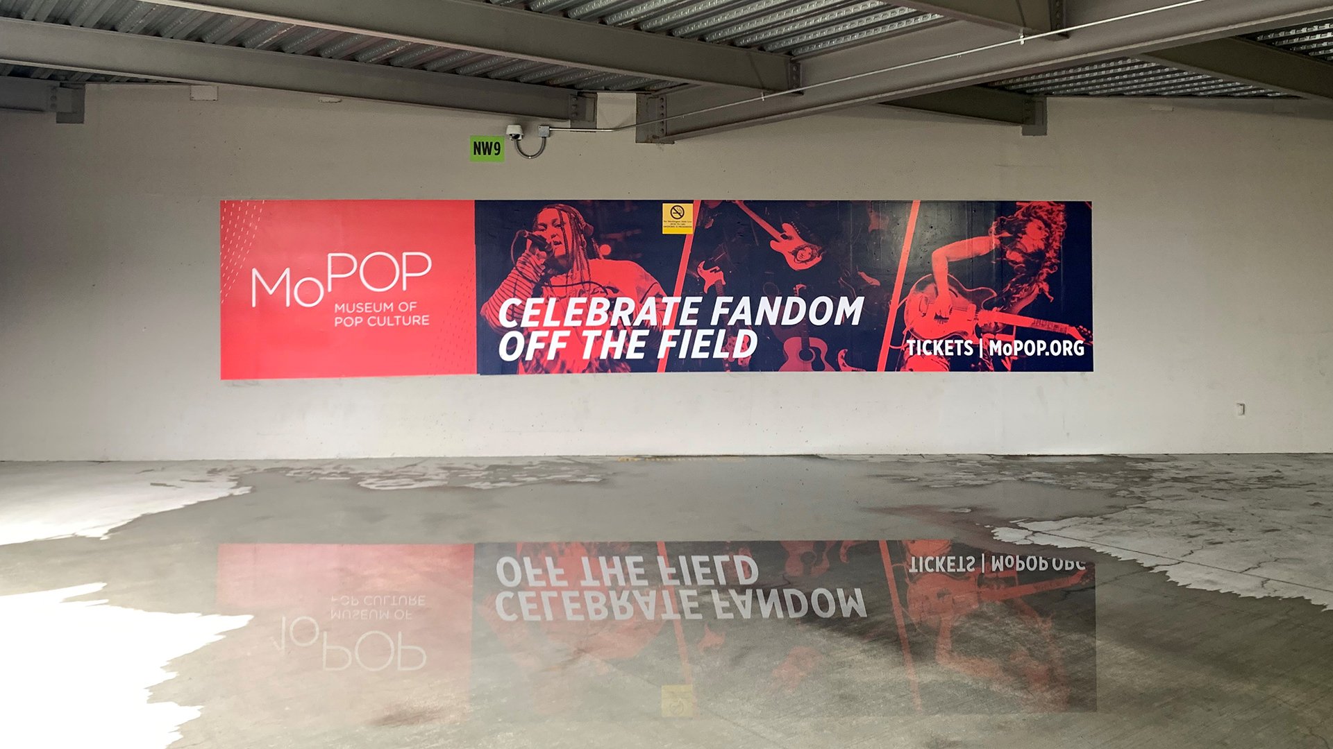
Lumen field banners - promotion
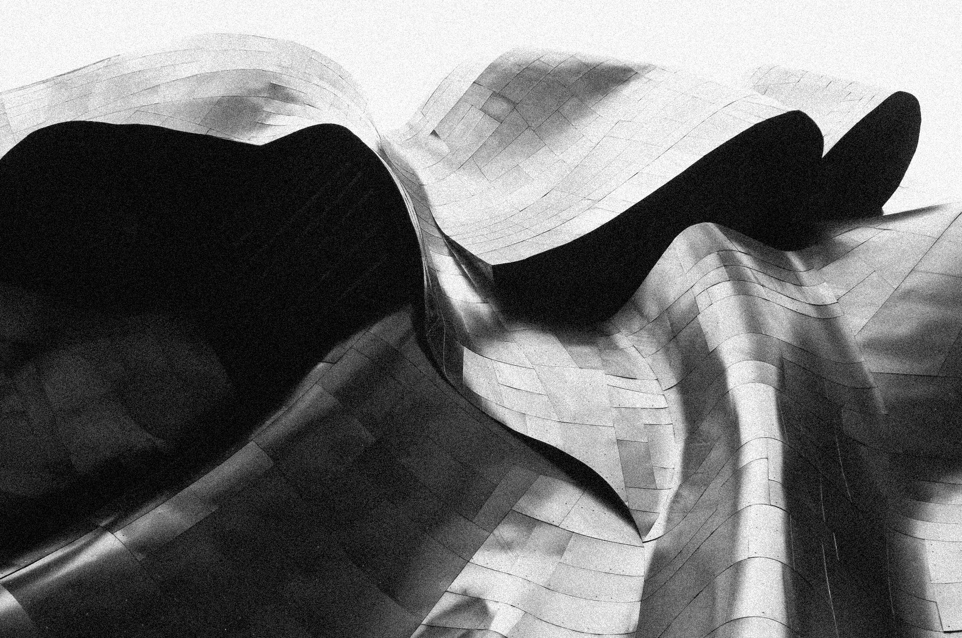
A set of promotional banners highlighting MoPOP’s three main celebrated areas of pop culture experiences at the museum: gaming, music, and science fiction. Now on display at Lumen Field in Seattle.
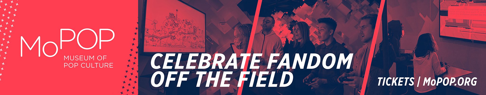
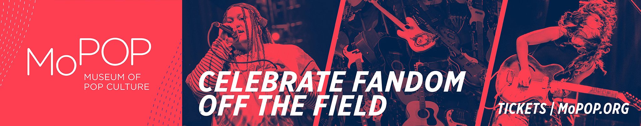
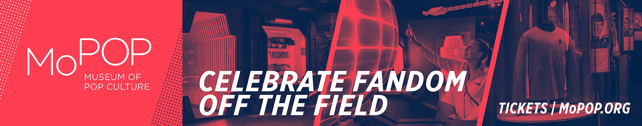
The tagline “Celebrate Fandom Off the Field” is meant to encourage the devoted Seattle Sounders fanbase to celebrate these areas of pop culture in which they may be fans as well. The banners feature the signature MoPOP red, and duotone images in a similar layout between all three for a cohesive look. To add subtle differentiation between the three experiences, I used different patterns to frame the MoPOP logo on the left side of the banners.
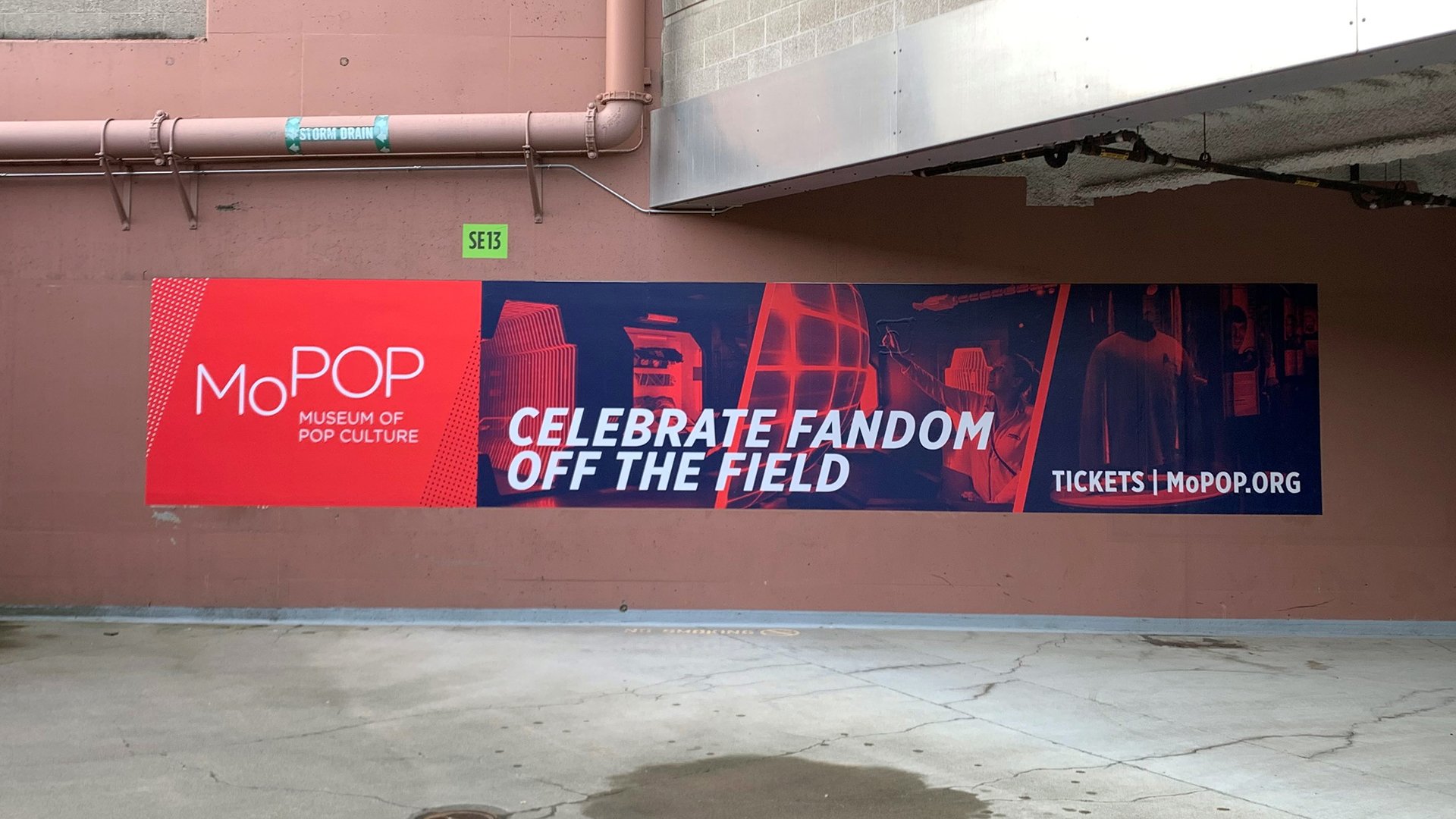
Banners on display.
2022 post-holiday card - advancement campaign
Design for a pop culture inspired post-holiday card mailed out to MoPOP supporters in early 2022. Requested by MoPOP’s advancement team.

In an initial brainstorming session with the creative team, I identified two concepts to create rough drafts of to present to the advancement team.
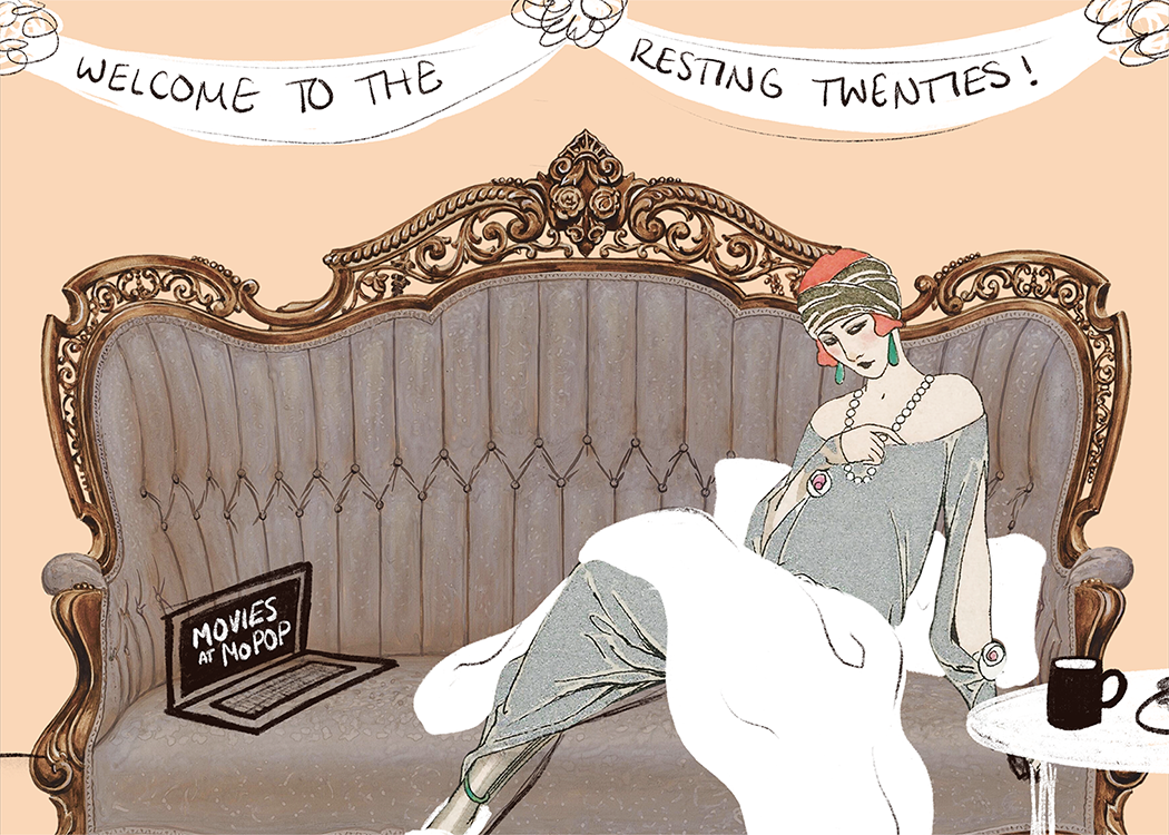
The first concept, left, is a play on the term “Roaring Twenties” but inverting the message to become the “Resting Twenties”, to playfully encourage prioritizing rest and self-care during this strange time. The design itself is a mix of existing illustrations and digital illustrations collaged together to represent a 1920’s flapper resting on a chaise lounge while watching a movie through the “Movies at MoPOP” program. While the concept was liked, the advancement team was concerned that people who received the card wouldn’t understand the message right away.
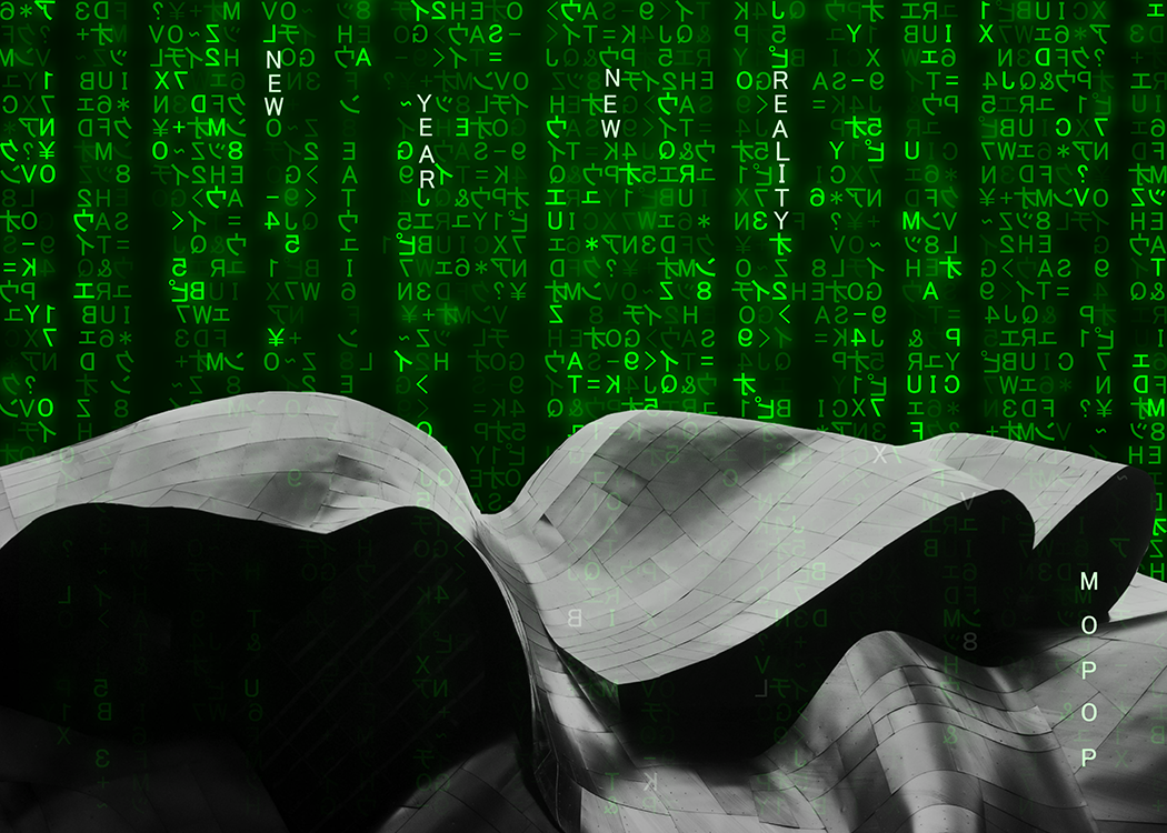
The second concept, right, is a Matrix-inspired design using the phrase “New Year, New Reality”, which is incorporated into the iconic green rain. The design shows the green rain texture raining down over the unique MoPOP building. The advancement team preferred this concept, for its reference to a clear pop culture phenomenon (The Matrix), for its feature of the unique MoPOP building, and for the message that we can create and connect in a “new reality” in the new year.
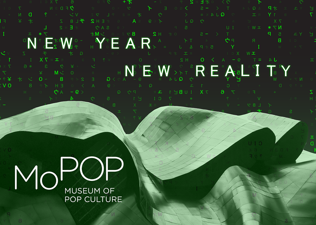
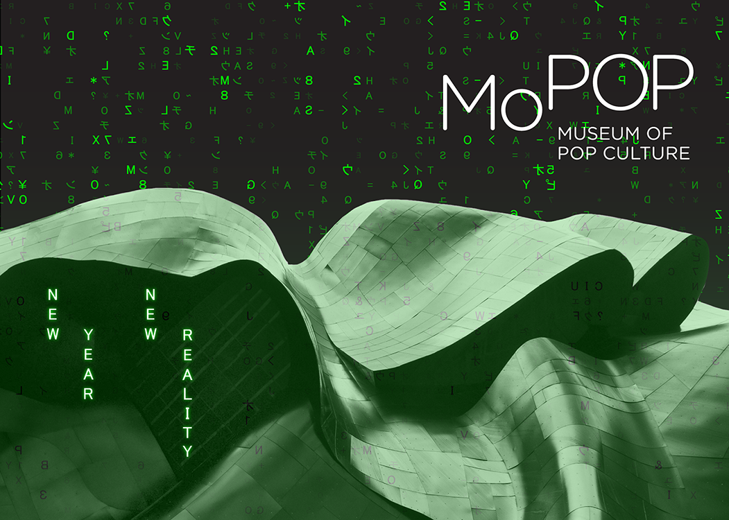
After we decided on the Matrix-inspired concept, I refined the look and provided two options for the type layout using the main message “New Year, New Reality”, as the phrase was hard to read in the initial concept draft. The first layout was chosen for its legibility with some notes for refinement.

A final round of refinements on the outside of the card, including making the MoPOP logo more subtle and extending the green rain texture to the back. The inside included the green rain in subtle way, with a short message that allows room for a personal message to be written on the inside. The envelope includes a pattern reminiscent of the waves of the MoPOP building.
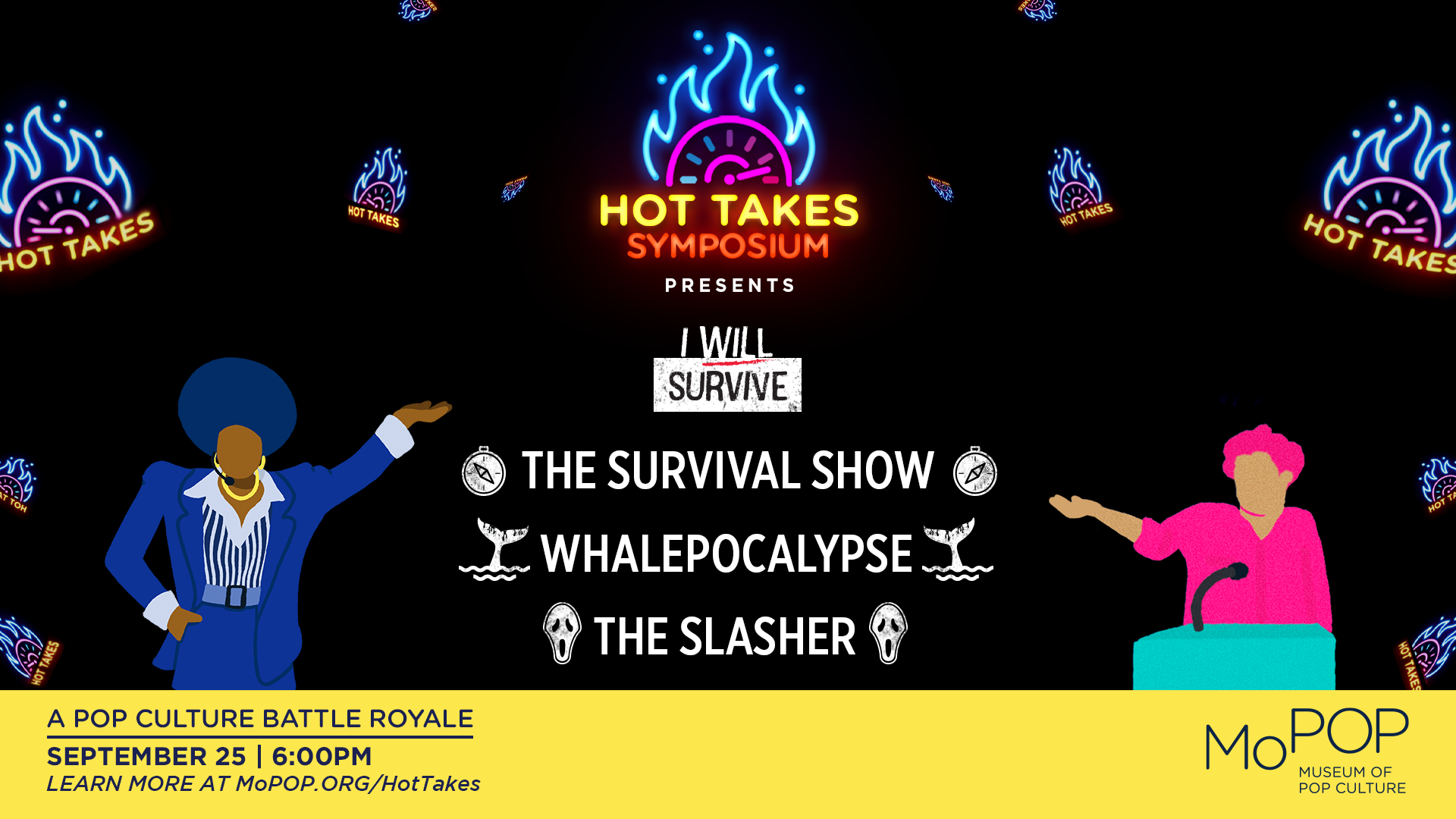
Hot Takes icons - program event
A set of icons I designed for MoPOP’s “Hot Takes” debate series. Given the theme of “survival”, I sketched and created final icons that were then implemented into the existing Hot Takes brand design, then created marketing assets for social media and in-museum promotion.

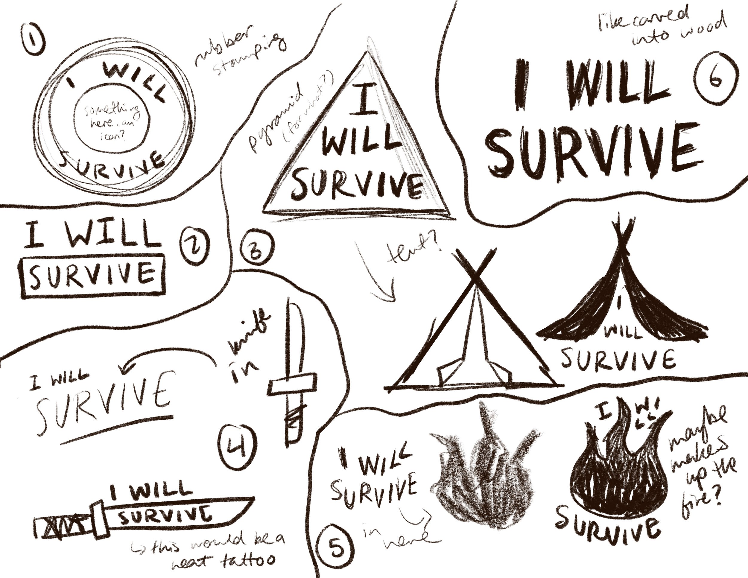
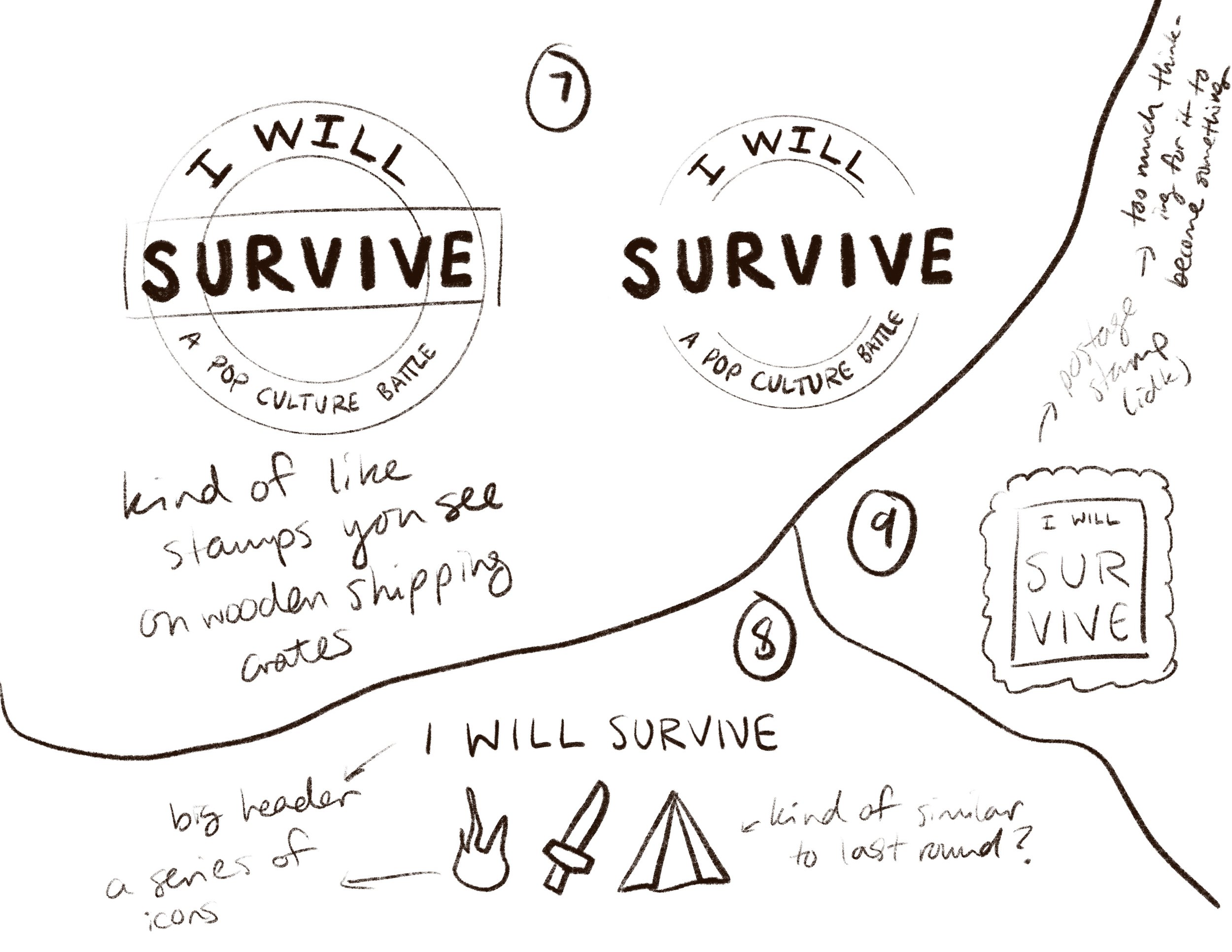
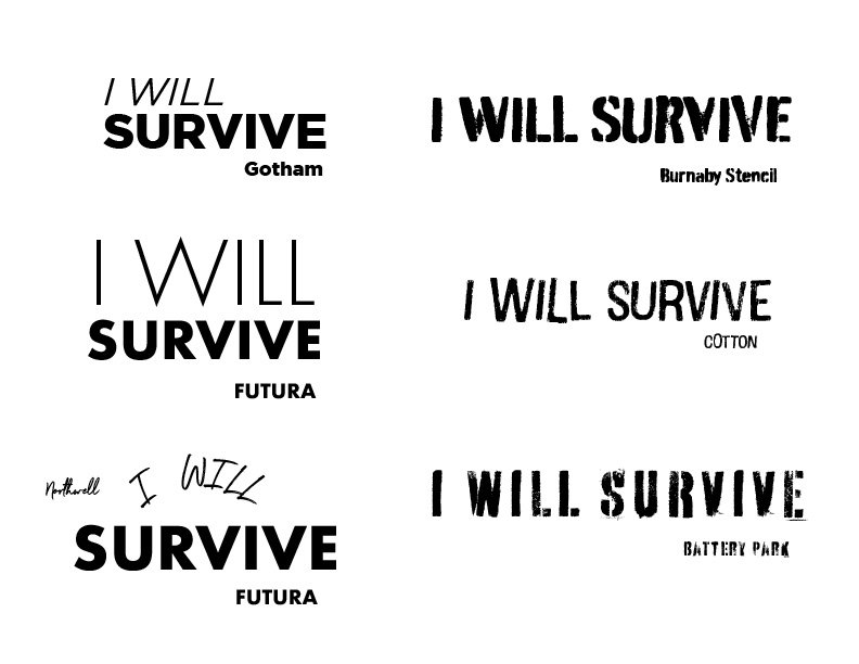
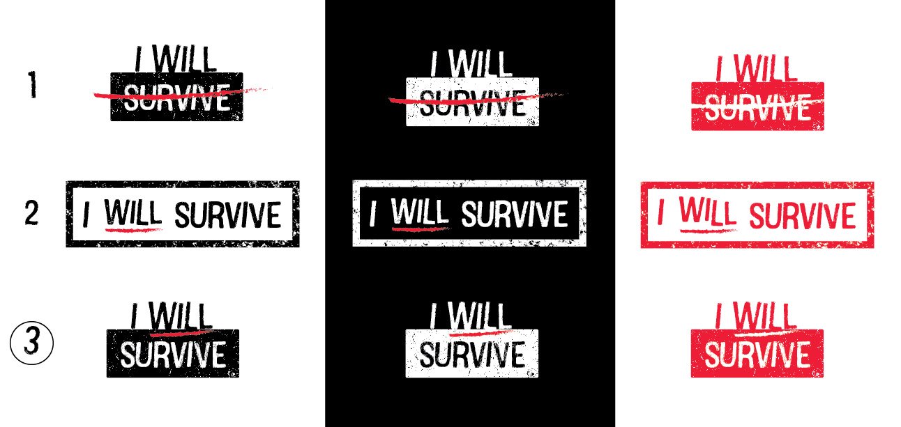
Sketches and type iterations. After choosing the main title icon, I quickly created the rest of the icons based off of the themes of each round of the debates.
education programs poster - program promotion
Type and layout design for the education department’s informational poster for 2022-2023 programs. The illustration had already been commissioned for the poster, so I focused on making sure the copy interacted with the illustration in a cohesive layout.
